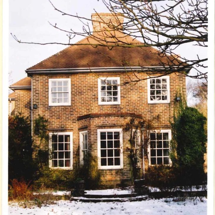
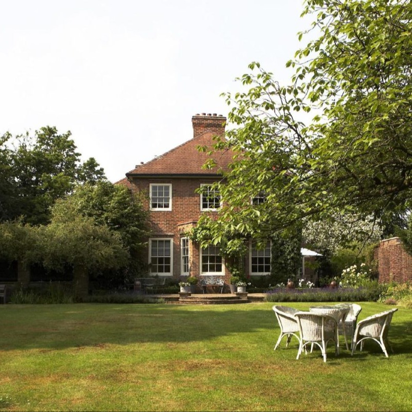
I thought I would write about a refurb on a house that is very personal to me, my own home where I was both the client and the designer.
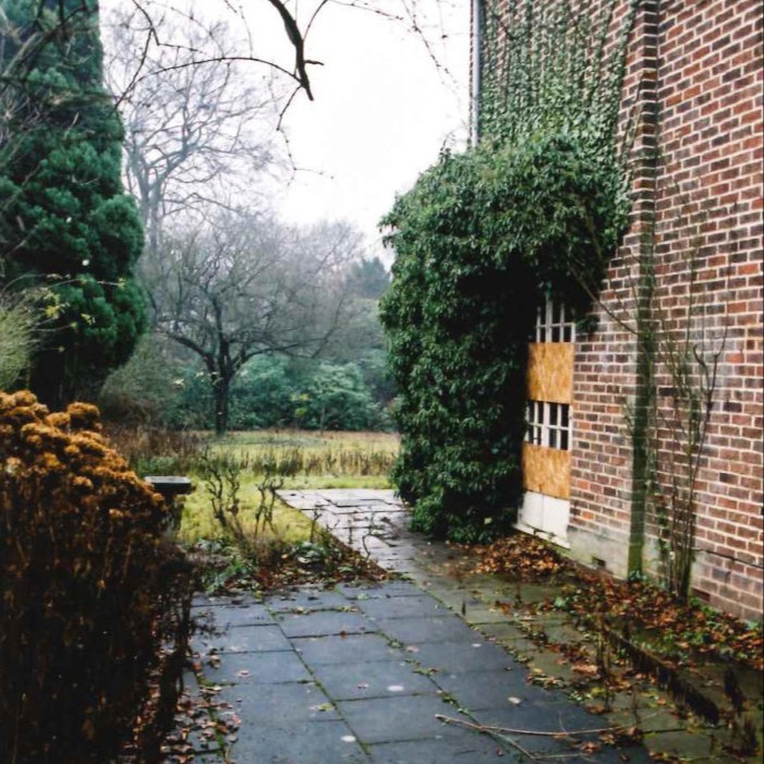
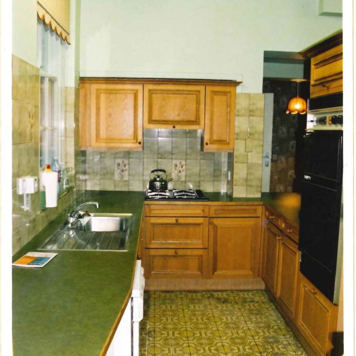
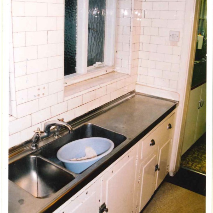
When we bought the house it had been neglected for some years and though it was structurally sound, the house had a very tired look to it inside and out.
We only lived a mile away from the property and I must have driven past it for years without noticing it. There are many mature trees on the site and they had been allowed to take over and obscure the house from view. To us it was perfect, it was like an oasis in the midst of the city, and it had the feeling of a country house.
First we set about taking a measured survey of the property together with the garden which we then drew up using auto cad which gave us a very accurate base to work on, I always recommend starting any project by having accurate plan and elevations, it is so much easier to put your ideas on paper to scale knowing that they will fit.
We had decided that we would work on the property and complete as much of the work as possible before we moved in, this allowed us to be more radical in approaching the work to be carried out as we didn’t have to live in it.
With the benefit of the initial survey drawings, we were able to spend time planning the whole house.
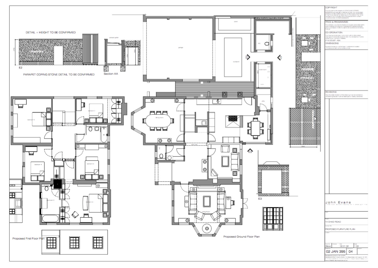
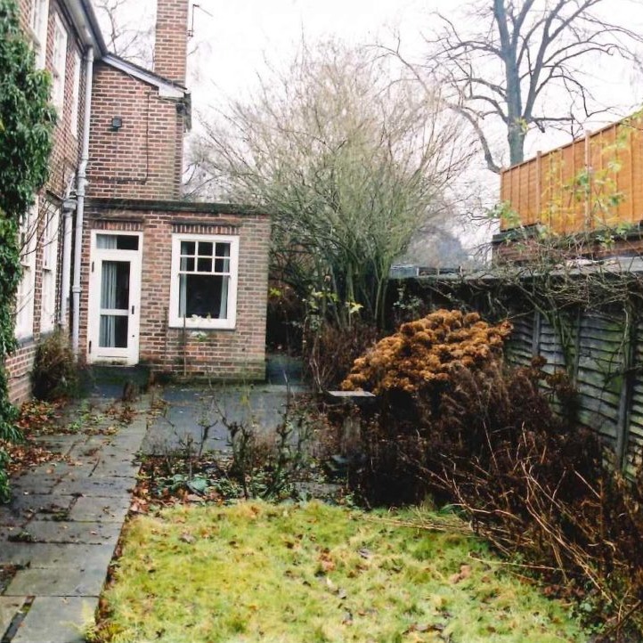
On the ground floor we had decided that part of the property that needed the most attention was the kitchen. It was a series of small rooms with a corridor to the back door which took you out into a dilapidated courtyard and door which led to the main garden. We decided to take out all of the walls to create one big space and increase the size further by extending the area with French windows, which we had identified through our planning process would be a nice place to have a dining table.
We had to modify these plans slightly and leave part of one wall standing. This was apparent once we had appointed a structural engineer to advise us. We had a very large chimney stack above the kitchen area. We could have taken it down but we felt that we should retain it as it is important to the integrity of the house.
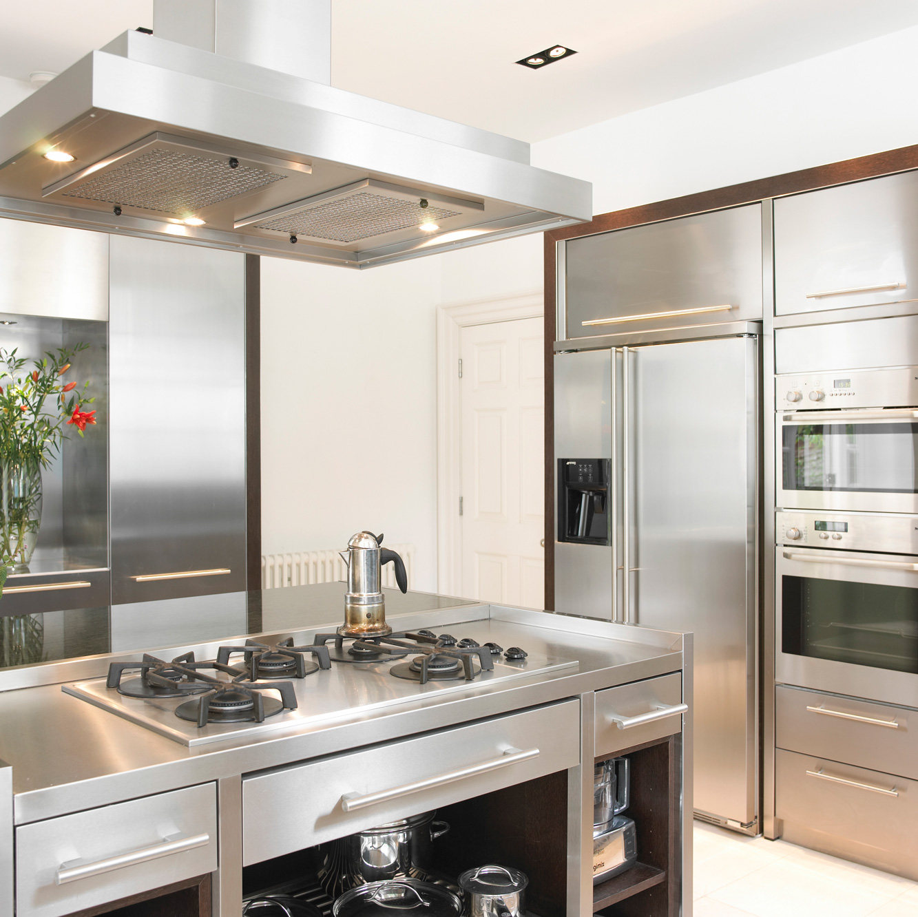
The wall became a backdrop for the hob unit and purpose made extractor and works well as a break between the cooking and dining area. Sometimes decisions are forced upon you which can work out well, in these situations it is best not to panic but to work around them.
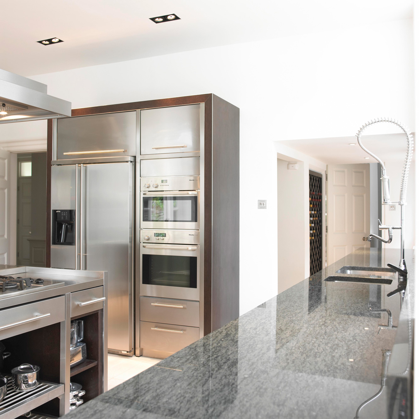
Both my wife and I are keen cooks and I wanted the kitchen to have the feel and functionality of a professional kitchen without sacrificing style and quality, we wanted a kitchen where we could chat to friends and family whilst preparing a meal. I am pleased to say that we achieved this as the kitchen really is the hub of our home.
I had decided that I would have two monolithic units constructed with outer covers of fumed oak edged in angled steel, (to avoid damage) containing on the one side two pull out larder units and storage with pull out drawers. I also included in this unit a recess for flowers (not something you see in a professional kitchen but essential I felt in our kitchen). The other unit contained American style fridge freezer and two ovens plus drawers and overhead storage.
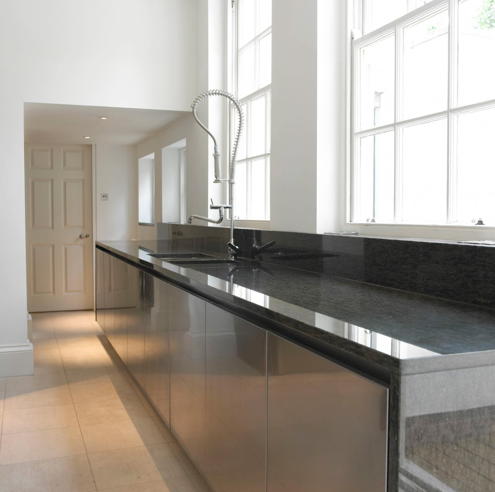
On the wall looking out onto the courtyard, there is a long run of units with sinks and commercial wash up taps and uniform stainless steel doors, behind these doors are dishwashers, drawers and cupboards that run into a small space with wine racks and an area for coffee making. The door at the end of this run leads to the dining room making it perfect for serving food.
I know that most people choose their kitchen from the range of a specialist designer and manufacturer but as designers we are very often commissioned to design individual kitchens and for me it was very important that I designed as much of the house as possible.
After we had planned the kitchen including the layout we were able to plan the lighting and the positions for the electric sockets and spurs, as in all layout plans once we had fixed where everything was going all of the other essential services follow on.
We are lucky and have high ceilings in our Kitchen so we were able to position the lighting to give perfect overall lighting and atmosphere, if your kitchen ceiling is lower be careful that the lighting onto the work services is not behind you as this will cast a shadow, the best place is over the units. We always use LED lighting in all our current schemes with a colour temperature of 3000K.


